Carbon stripes
Inspired by the warming stripes of Ed Hawkins, the carbon stripes represent yearly CO2 emissions through stripes and the remaining CO2 budget of the 1.5°C and 2°C scenarios with dotted lines.
 made with ggplot2
Some context
The carbon stripes was inspired by the warming stripes visualization created by Ed Hawkins (see showyourstripes.info). In the warming stripes visualization, each stripe represent a year (from 1850 to 2021) and the stripe's color indicates year's global temperature on earth from blue (cooler) to red (warmer). This is a simple and powerful visualization showing global warming intuitively.

Carbon stripes
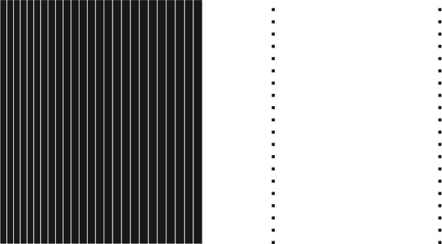
The carbon stripes aims at representing yearly CO2 emissions through a simple visualization. The carbon stripes also represent the remaining CO2 budget of the 1.5°C and 2°C scenarios.
As in the warming stripes, in the carbon stripes each year (from 1850 to 2020) is represented by a stripe. However, in the carbon stripes the width of each stripe depends on the year's CO2 emissions: The more CO2 was emitted, the larger the stripe. Consequently, you can see below that recent years have larger stripes, because world's CO2 emissions are still growing: each year we emit more than previous years.
The carbon stripes also represent the remaining CO2 budget of the 1.5°C and the 2°C scenarios. These budgets are represented by two dotted lines, the closer one for the 1.5°C budget and the one on the right edge for the 2°C budget. Otherwise said, to stay below 1.5°C (with 67% chance) all of the stripes from now on to 2100 should fit between the last year's stripe and the closer dotted line. Similarly, to stay below 2°C (with 67% chance) all the stripes from now on to 2100 should fit between the last year's stripe and the dotted line on the right edge.
This post is updated yearly to take into account new emissions, the first version was done in 2022 taking into account emissions up to 2020. The current version takes into account emissions up to 2023. For now, we still do not observe a decrease in CO2 emissions (except in 2020 due to COVID).

Blatantly, carbon stripes of the next years will have to shrink if we are to meet the Paris Agreement.
Your own carbon stripes
Visualizing the carbon stripes starting from the year of our birth gives a good sense of how fast we could overshoot the Paris Agreement if emissions do not decrease. The app below allows you to create your own carbon stripes by starting the stripes from the year of your choice (between 1850 and 2022). You can see that with current amounts of yearly CO2 emissions (around 40 billion tonnes), we would overshoot the 1.5°C budget around 2030 and the 2°C budget before 2050.
About the carbon stripes
The carbon stripes visualization was generated using R and the ggplot2 library. The app was created using the shiny library, click here to open the shiny app in a stand-alone web page. Data for historical CO2 emissions were gathered from Our World In Data API (see ourworldindata.org/co2-emissions). Note that we included emissions coming from land use change. Data for the remaining CO2 budget of the 1.5°C and 2°C scenarios were gathered from the IPCC AR6 report of Group 1 (see IPCC AR6 WG1 report).
This work is under a CC-BY-SA license, do not hesitate to download and share the carbon stripes, especially the one starting from the year of your birth.
Feedback on the post is appreciated, do not hesitate to reach me via email.